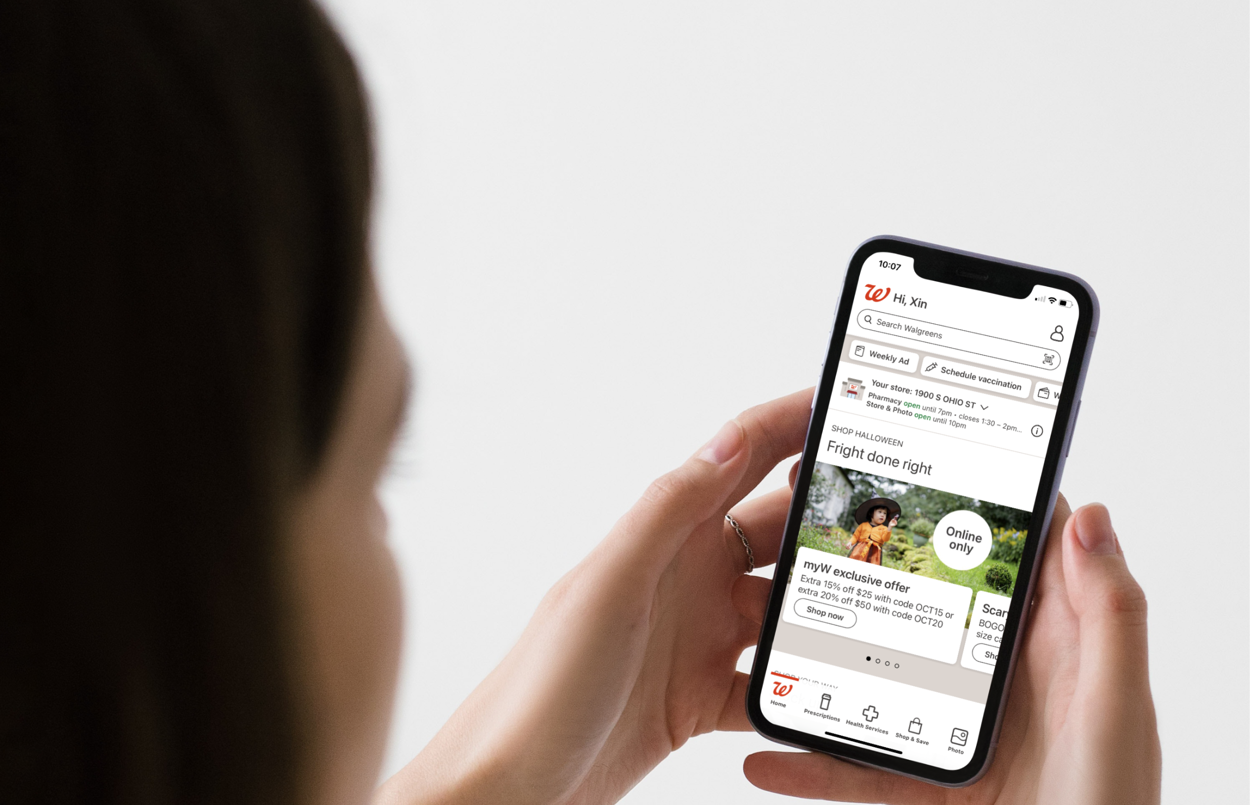
Walgreens App Shopping Experience
Overview
The Problem
Walgreens is the leading brand of healthcare, pharmacy and retail based in US. Based on the existing data, the drop-off rate decreases on each page in the shopping experience, leading to an overall low conversion rate and poor user experience. Therefore, there are issues that need to be addressed.
The Goal
Redesign the existing app shopping experience, from discovery and browsing to checkout, to make it more user-friendly for a seamless and enjoyable shopping experience.
The Key Metrics
- Drop-off rate
- Conversion rate
- User engagement rate
- Customer satisfaction score
My Role
- Redesigned Homepage and Product Detailed Pages. The tasks included:
01 UX Research - Audit and Competitor Analysis
I conducted an app UX audit to quickly identify main issues by categorizing key features into three main groups on the homepage:
- health & wellness services (find care, prescription, vaccination, and refills)
- promotional elements (hero sections, advertisement banners, and special offers)
- products (product categories, and recommended products)
When evaluating the product detail pages, I categorized the functionality into eight high-level categories:
- product overview (product name, price, reviews)
- product images
- purchase options
- CTA button
- product information
- loyalty & rewards
- reviews
- product recommendations
Findings from UX audit
Competitor Analysis
I looked at the operations and app designs of major competitors like CVS, Walmart, Target, etc., to understand what makes them successful. This helps me see how well Walgreen's app compares to theirs and where we can improve.
02 Define Persona & User Journey
With the research data, I collaborated with other designers to summarize user journey insights, including the pain points and opportunities while browsing on the Walgreens app.
03 How do I prioritize the solutions?
04 Ideation
Wireframes: I generated a bunch of concrete contents/ideas/wireframes by pens and papers. It helps me to rapidly visualize and grasp my concepts.
After sketching with pen and paper, I transition the wireframes into digital versions, noting the pros and cons of each. This allows for discussions with other designers and gathering valuable feedback.
05 Final Touches & Delivery
06 My Takeaways
Having completed this project, I had two key takeaways:
💡 How to navigate through ambiguous situations?
When I joined Walgreens, just one week into onboarding, I became part of a new project with an entirely new team. Faced with numerous unknowns and lacking prior research or design, I felt confused about the project's scope. To gain clarity, I initiated a literature review of past research projects at Walgreens, attended weekly engineering meetings for technological insights, and participated in design system office hours for future design work. This proactive approach helped me narrow down the project scope and identify achievable goals.
💡 How can I become more confident when advocating for the design?
I sometimes struggle with confidence when advocating for my designs, fearing inadequacy and stressing about meeting perfection in every requirement. Despite this ongoing challenge, delving into the business side of UX, including skills in heatmap tools, Google Analytics, and SEO, has significantly bolstered my abilities. As a designer, I now seamlessly integrate user needs with business considerations, enhancing my effectiveness in communicating with business owners and product managers. This proficiency proves especially valuable when persuading them to implement business-aligned designs.