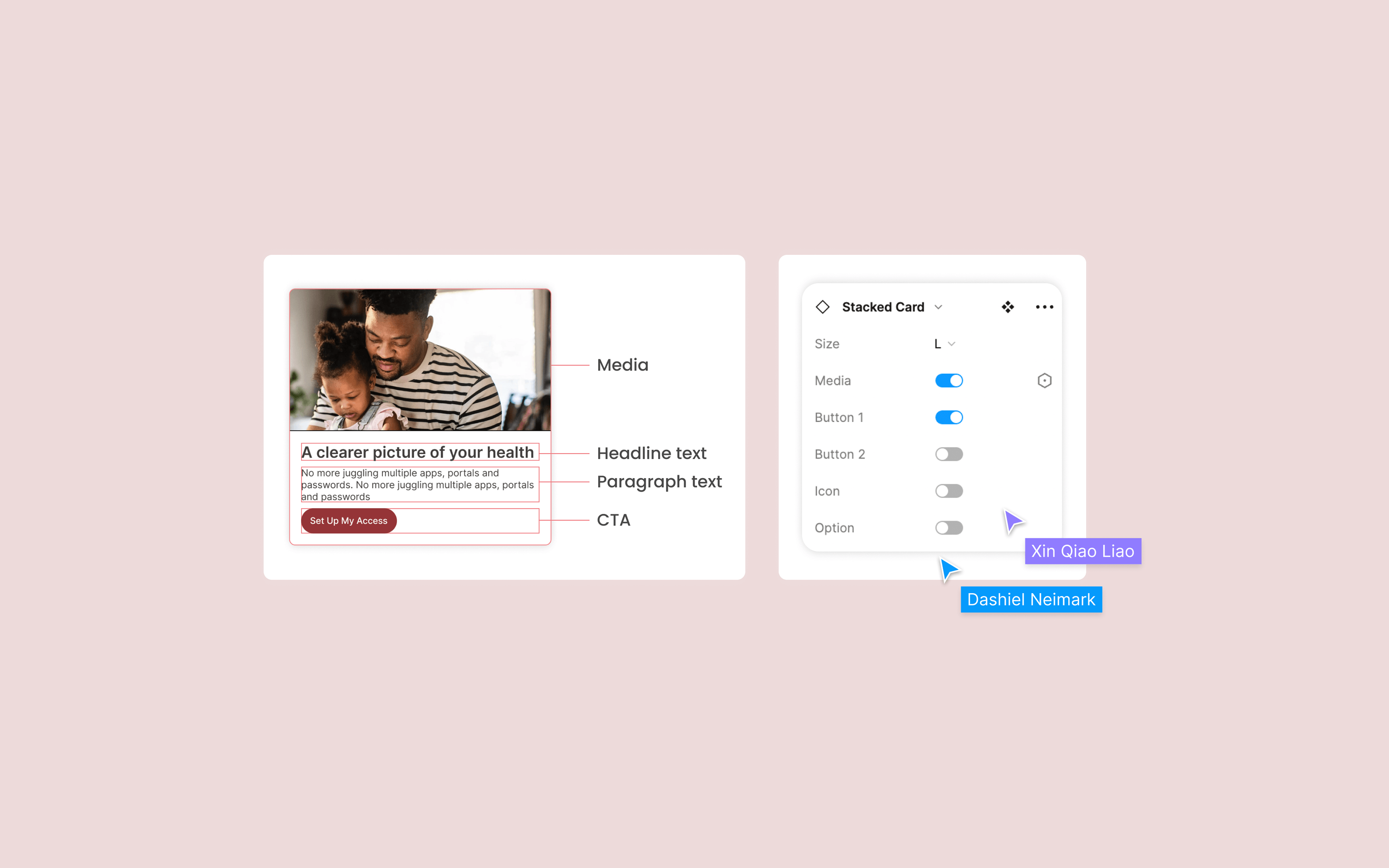
Walgreens Unified Cards
Overview
Background
Walgreens underwent a rebranding and revamping of the entire platform in 2023. We found that it had many card types and design languages. There were no guidelines on how and when to use each card type. Designers created their own cards in individual files, causing a lot of confusion. This project aims to unify cards, provide clear guidelines and best practices for our teams, and deliver a thoughtful customer experience.
01 UX Audit
I began by conducting an audit of the app. My goal was to identify all the cards present in the app and evaluate each one. The audit revealed that we have 28 types of cards used in the app. This evaluation involved identifying where each card is placed in the app, its use scenario, the elements comprising each card, its size, any accessibility issues, and recommendations on how we could improve them.
02 Define Persona & User Journey
I looked at industry examples for designing card components, such as Google Material Design, eBay Mind Patterns, and Shopify Polaris. Each of them offers clear and excellent design guidelines and philosophies. However, I also realized that there is no one-size-fits-all best practice for us, as each company is unique, with different goals, principles, and philosophies. I took lessons from their experiences, and ultimately, we had to develop our own principles and philosophy for the design components.
03 Design Direction
Our team uses two resources to guide our design direction. 1) Design Direction Document - It's a collaborative document in Figma designed to help designers and engineers have productive conversations. It includes simple prompts such as: What is this component? Where is it being placed? Which platform has this component? What are the elements inside this component? How might we do it differently? What are the proposed anatomy or design?2) Design Review - It's is a place for designers and engineers to present the design direction, gather feedback from the teams, and achieve final alignment before moving on to detailed design. This process can surface thoughts or ideas that may have been missed during the initial phase of design direction.
04 Design
I categorized the 28 types of cards into 3 groups: stacked cards, product cards, and coupon cards. With variations, these three types of cards can cover most of the use scenarios in our app.
05 Documentation
After the design review with my team and fine-tuning the components, we merged the new components into our file and updated the components in our reference site. This included the types of cards, their anatomy, usage guidelines, and accessibility considerations.
06 Outcome
1) The types of cards in the current app have been unified from 28 to 3 types.
2) The design adoption rate is around 90%, as indicated by Figma Analytics, across the ongoing design files.
07 Next Steps
I didn’t get too much information about this part from the engineering side, but I want to learn about their tool for tracking code adoption. How do we evaluate the design system? How do we monitor the usage of the design system’s components and patterns by engineers? If we include this question in the early stage, I believe it will make this process more transparent, and our team will have more visibility, not just working in our own little bubble.